Skip to content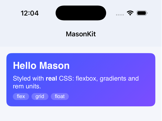
iOS 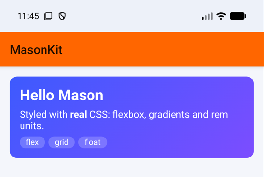
Android

MasonKit
MasonKit brings the web's layout model to NativeScript. Flexbox, grid, block and inline flow, floats and positioning are computed by a Rust engine built on taffy, and every element is drawn as a native view on iOS, Android and Windows. You write HTML-shaped elements and ordinary CSS; it works with plain NativeScript, Angular, Vue, Svelte, React and Solid.
Install
bash
ns plugin add @triniwiz/nativescript-masonkitA small example
html
<div class="card">
  <h2>Hello Mason</h2>
  <p>
    Styled with <strong>real</strong> CSS:
    flexbox, gradients and rem units.
  </p>
  <div class="tags">
    <span>flex</span>
    <span>grid</span>
    <span>float</span>
  </div>
</div>
css
.card {
  display: flex;
  flex-direction: column;
  gap: 8px;
  padding: 1rem;
  border-radius: 12px;
  background: linear-gradient(135deg, #3d5afe, #7c4dff);
  color: white;
}
.card h2,
.card p {
  margin: 0;
}
.tags {
  display: flex;
  flex-wrap: wrap;
  gap: 6px;
}
.tags span {
  padding: 2px 10px;
  border-radius: 999px;
  background: rgba(255, 255, 255, 0.2);
  font-size: 13px;
}Register the elements once for your flavour of NativeScript, as shown in Framework setup, and the markup above works as written.
What is not there yet
Most of CSS layout and painting behaves as it does in a browser, and the support matrix lists the differences per platform. The larger gaps today:
- Vertical writing modes only cover vertical text inside a horizontal layout: no upright CJK, and no vertical containers whose children flow vertically.